MEdWorkClouD & workClouD
MedWorkCloud Brand Identity:
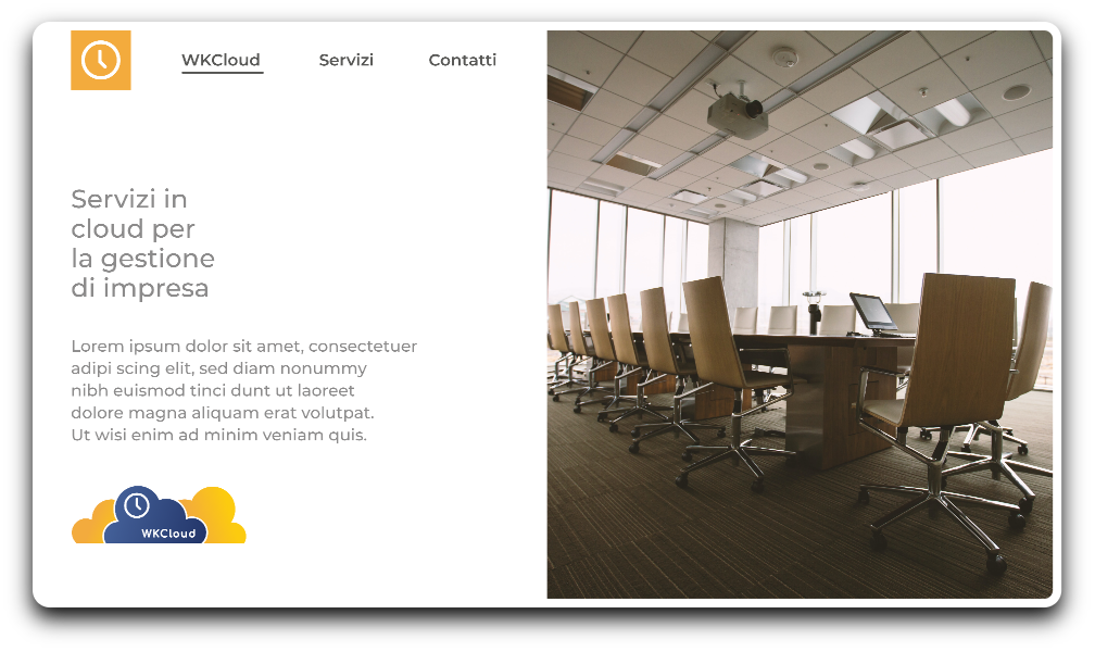
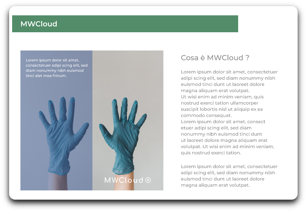
MedWorkCloud is designed as a management software that aims to make the archiving of sensitive medical data efficient and secure. The focus of the entire project is to make the consultation of documents and the production of certificates by healthcare personnel working closely with companies more efficient. The services provided are perfectly integrated in a cloud system so as to ensure a high level of confidentiality and accessibility.


WorkCloud Brand Identity:
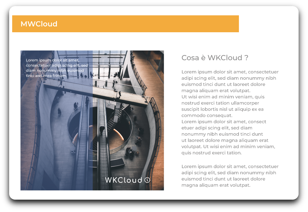
WorkCloud has refined the know-how previously developed to extend the documents archiving and management services to corporate management as well. The cloud-based system is developed to have a continuous flow of feedback about the positive or negative trend of work performances, providing an effective tool to adjust the trends of a company. Through this second cloud service it is possible to issue invoices, credit notes and manage both orders and customers with performing efficiency.
MedWorkCloud Brand Identity:
MedWorkCloud is designed as a management software that aims to make the archiving of sensitive medical data efficient and secure. The focus of the entire project is to make the consultation of documents and the production of certificates by healthcare personnel working closely with companies more efficient. The services provided are perfectly integrated in a cloud system so as to ensure a high level of confidentiality and accessibility.
WorkCloud Brand Identity:
WorkCloud has refined the know-how previously developed to extend the documents archiving and management services to corporate management as well. The cloud-based system is developed to have a continuous flow of feedback about the positive or negative trend of work performances, providing an effective tool to adjust the trends of a company. Through this second cloud service it is possible to issue invoices, credit notes and manage both orders and customers with performing efficiency.


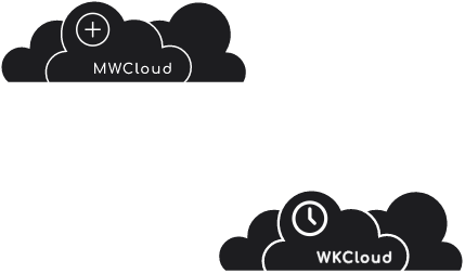
Logo characterization:
Matching the idea of health care service with a precise and efficient management has led to the use of the universal symbol of medicine (a cross) inscribed within a circular perimeter which aims to visually protect the most sensitive data involved.
Colors characterization:
A pale nuance of green recalls the idea of medicine and the matching with blue and white is a clear reference to cloud technology.
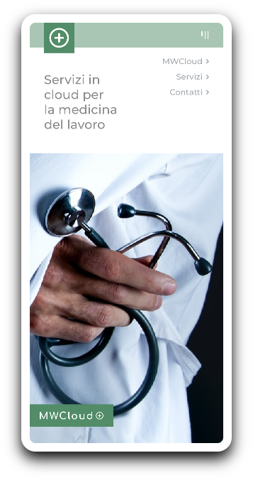
MWCloud
Servizi in cloud per la medicina del lavoro

MWCloud
Servizi in cloud per la medicina del lavoro


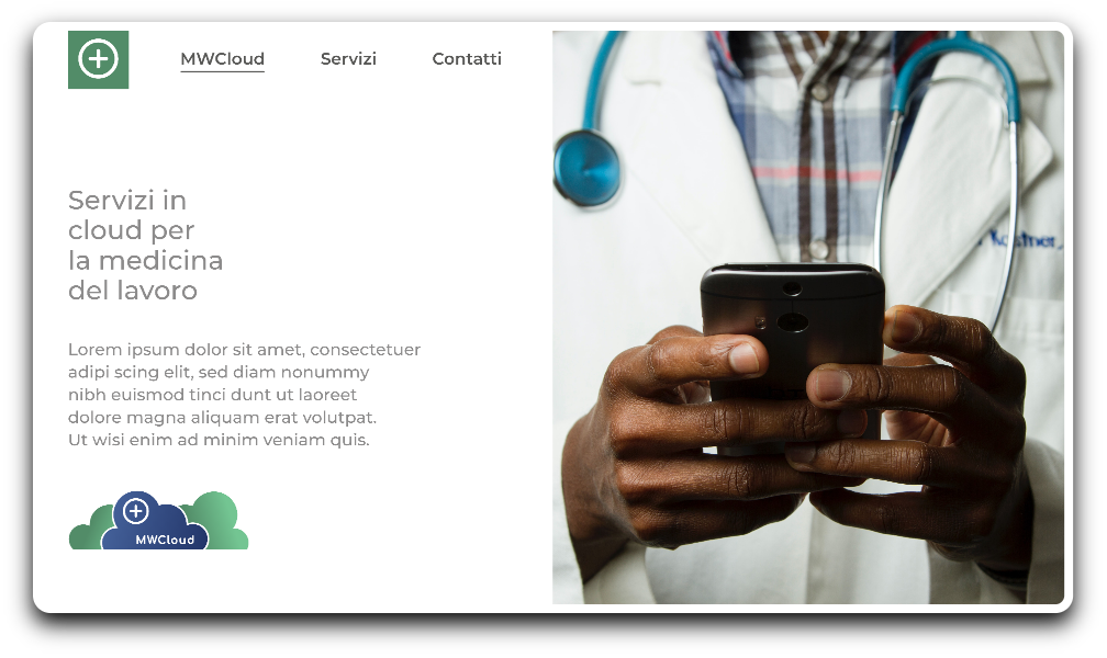
Logo characterization:
Consistently with the data-cloud services provided, WorkCloud focuses on the importance of keeping track of the time spent in the various phases of accounting management. Similarly to MedWorkCloud, the circular perimeter wants to recall the idea of protection and safety.
Colors characterization:
Yellow is a color connected to the idea of being vigilant and attentive, blue and white recall cloud technology.
WKCloud
Servizi in cloud per la gestione di impresa
WKCloud
Servizi in cloud per la gestione di impresa
Information Architecture I :
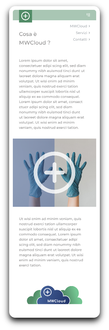
My primary objective was developing a clear web identity that could provide all the elements necessary to define the project and the services provided. To keep a simple and easy-to-navigate design, my concept was a one-page solution consisting of three main areas of interest. The first aims to define what MedWorkCloud or WorkCloud are and to which pain points they can answer. The second area is focused on the services and pros offered. The third one aims to facilitate a further contact with potential clients.
Information Architecture II:
Providing the correct amount of information is a critical task to fulfil. Presenting a cloud-based service to improve the accounting capabilities of a company on one side and provide a flexible tool to keep track of patients and documents on the other, is the key concept to showcase. Engaging the potential customers and pushing them to keep scrolling in search for more detailed insights about the products presented, has to be balanced with a clear presentation of the advantages of choosing such service.


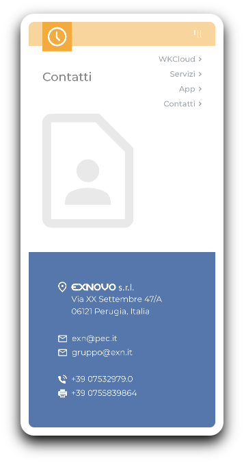
Information Architecture III:
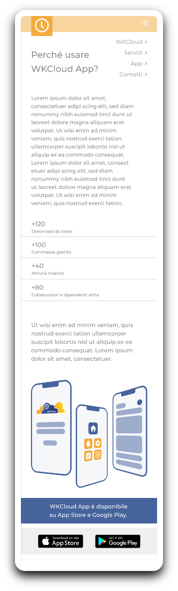
Defining services was a central component of the design. Highlighting key words and associating them with the product’s logo provides an immediate focus on a hierarchical list of valuable assets for healthcare personnel and companies’ management. To inspire trust and showcase already acquired customers, I added a counter of significant numbers of documents archived, and types of users.

Mobile UI - Part II:
An easily accessible menu on the left has been added to ensure a quick tool to navigate the pages. Consistency and brand visual guidelines have been ensured by a cohesive design that inspires trust to users that have also experienced the desktop version of the webpage.
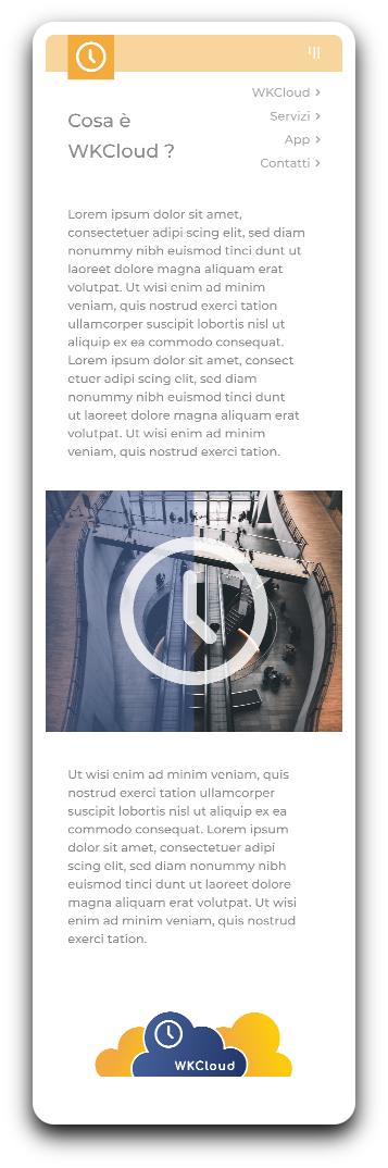
Mobile UI - Part I:
The mobile experience has been designed to have the same user feeling of the desktop one. In this case, having a responsive website was useful to better organize informations on a different sized and shaped screen.
Mobile UI - Part I:
Considering the nature of the product and services provided, designing a responsive website for mobile could add a great deal of value to the presentation of perks for both MedWorkCloud and WorkCloud.

Mobile UI - Part II:
An easily accessible menu on the left has been added to ensure a quick tool to navigate the pages. Consistency and brand visual guidelines have been ensured by a cohesive design that inspires trust to users that have also experienced the desktop version of the webpage.


