Exn


EXN Brand Identity - Part I:
EXN aims to be a hub for developing a conscious innovation. Computer technology, connectivity and its drive to the future were just three of the main pillars I used to design a new a modern identity for this company. Condensing a complex and long established history into just three letters wants to instil a sense of change and improvement. The focus is naturally shifted towards the central element, a single component embodied by the X that recalls the idea of a connection between extremes.


Components:
Each element can be inscribed within a square creating a sense of symmetry and balance. Curves and shapes have the same height and length to recall the ideas of stability and firmness.


Components:
Each element can be inscribed within a square creating a sense of symmetry and balance. Curves and shapes have the same height and length to recall the ideas of stability and firmness.


EXN Brand Identity - Part II:
Aiming for progression and innovation, I designed the company symbol. Following the same guidelines I used for the logo lettering, my initial concept evolved into a new element. This arrow-shaped form summarizes the will to move froward from past to present and embodies a mindset of efficient use of technology instead of its passive absorption.

EXN Brand Identity - Part III:
EXN (consulting and technological innovation) means connectivity, empowerment and tailor-made technology. The logo’s shapes and curves need to be considered as a unique piece made by swift and consistent lines moving across past to reach the future, combining them together as one.
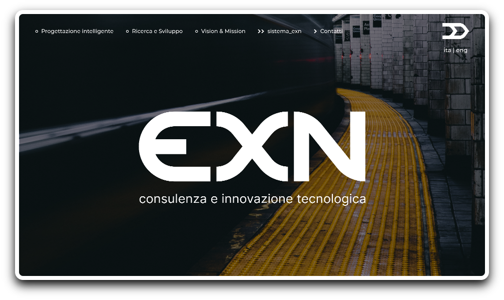
Web Identity - Part I:
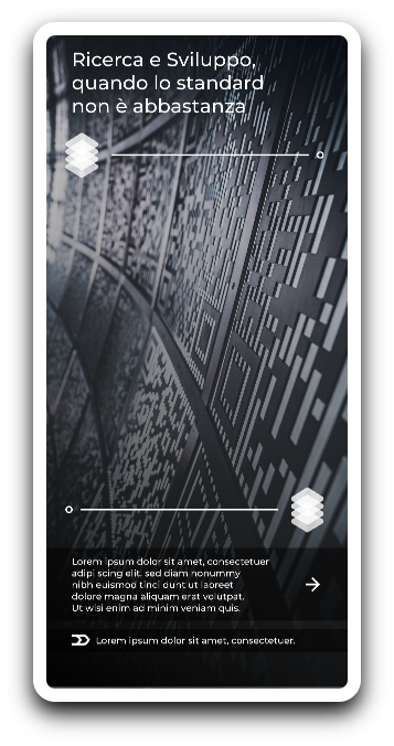
In order to develop a brand new web identity for EXN, I had to consider how to organize all the informations necessary to define a complete picture about about the company’s major areas of interest. I chose a clear menu at the top and a one-page solution with different chapters, each one dedicated to a specific topic: network and connectivity design, research and development, vision and mission, EXN system, and contacts.
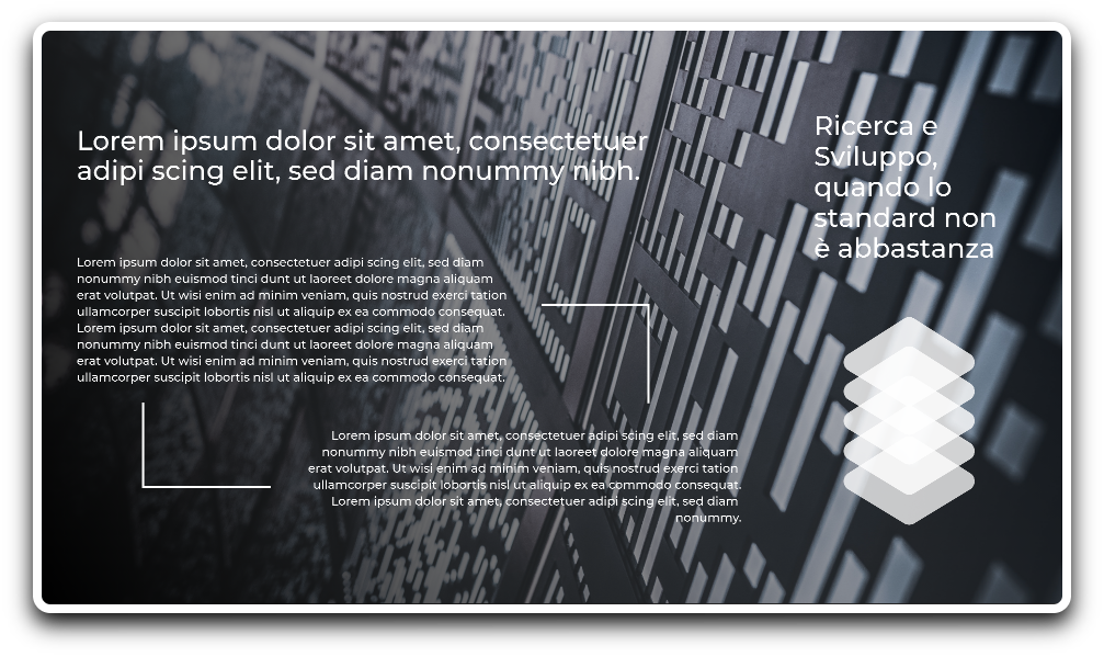
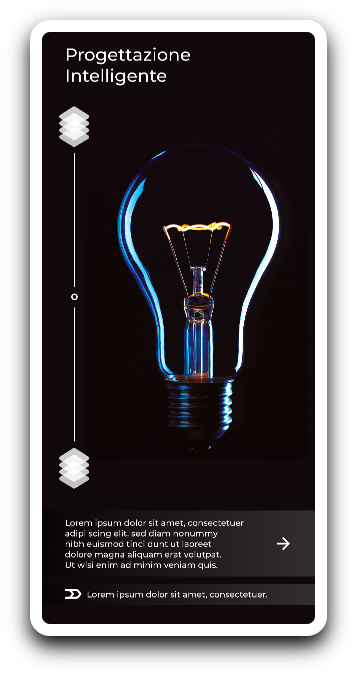
Web Identity - Part II:
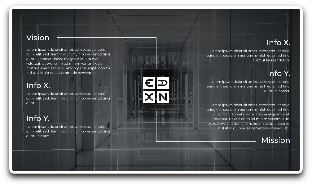
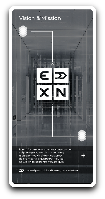
Each one of the sections is characterized by a neutral background and displays information about the company’s guidelines and core standards. The idea of connecting elements is a recurring theme used to provide a deeper level of insight and, at the same time, to showcase the process of ideation and prototyping used to refine ideas and new concepts. The chapter “Vision and Mission” is focused on highlighting the present state of the company, its values and its goals for the future.
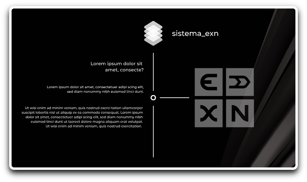
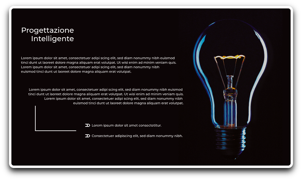
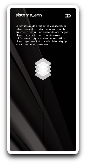
Information Architecture:
The “EXN_system” has been designed as the core of the website. In this section all the products and services provided by the company are listed along with a summary of informations, statements of value and insights. Each one of the products is meant to be seen as a structural component of a more complex ecosystem of services that can be exploited in its entirety or by using a single element. Each unit of information is meant to be coherent with the other ones, and all of them are encapsulated by visually similar stripes included inside the system.
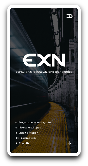
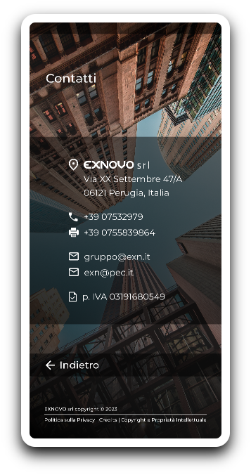
Mobile UI - Part I:
The mobile experience has been designed to have the same user feeling of the desktop one. In this case, having a responsive website was useful to better organize informations on a different sized and shaped screen.
Mobile UI - Part I:
The mobile experience has been designed to have the same user feeling of the desktop one. In this case, having a responsive website was useful to better organize informations on a different sized and shaped screen.

Mobile UI - Part II:
Having multiple pages instead of one was the best solution to provide more insight without compromising the accessibility and at the same time, to stick to a previously approved hierarchy. Navigation has been organized with recognizable icons and prompts. In this design as well, images and text are balanced to improve the overall experience.