EasyONEPAGE

Brand Identity - Part I:
Easy|One|Page (EOP) aims to be a flexible platform designed to upgrade your web presence with a performing efficiency and keep your content always updated. Choosing between a rich selection of templates, selected to be used by companies, content creators, portfolios and blogs, it’s the essence of personalization that EOP embodies. Creativity and simplicity at their finest are what matter. (EOP logo was designed by BCPT associati)
Colors characterization:
Strong contrasts of opposite tones are used to highlight content and brand elements. Using white text on a dark background makes elements pop-up and the grey enclosures help smooth the transitions. Choosing this fluorescent green hints at vintage computer displays and their iconic screens with homogenous text walls. (EOP logo was designed by BCPT associati)
Brand Identity - Part II:
Connecting people to their web identity is the other side of the coin. Creativity and simplicity alone can’t provide a good tool to define and characterize an online presence. Upgrading is a key feature of everyone’s identity, and including this aspect into the brand was a fundamental milestone. Developing a website is just the first step, facilitating the other ones is equally as important. This is what EOP is designed to do: connection with a continuous flow of new information.


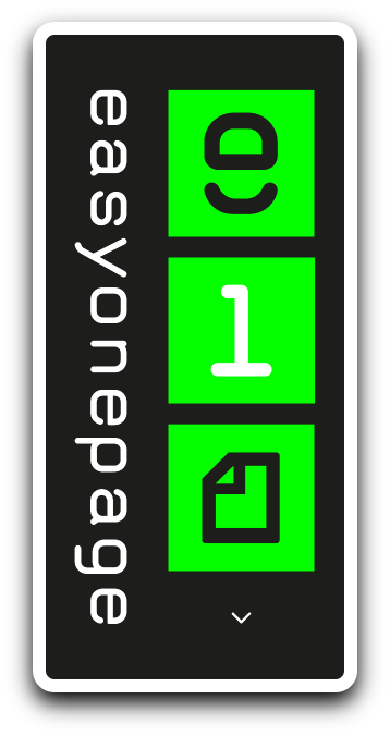
Brand Identity - Part III:
Having three equal elements (each one characterized with a recognizable and unique pictogram) recalls the idea of a three step process: identifying a solution for a specific need, choosing a solution between many and approving a design to share a content.

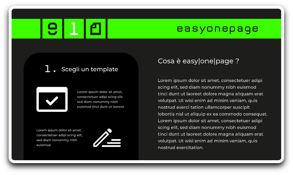
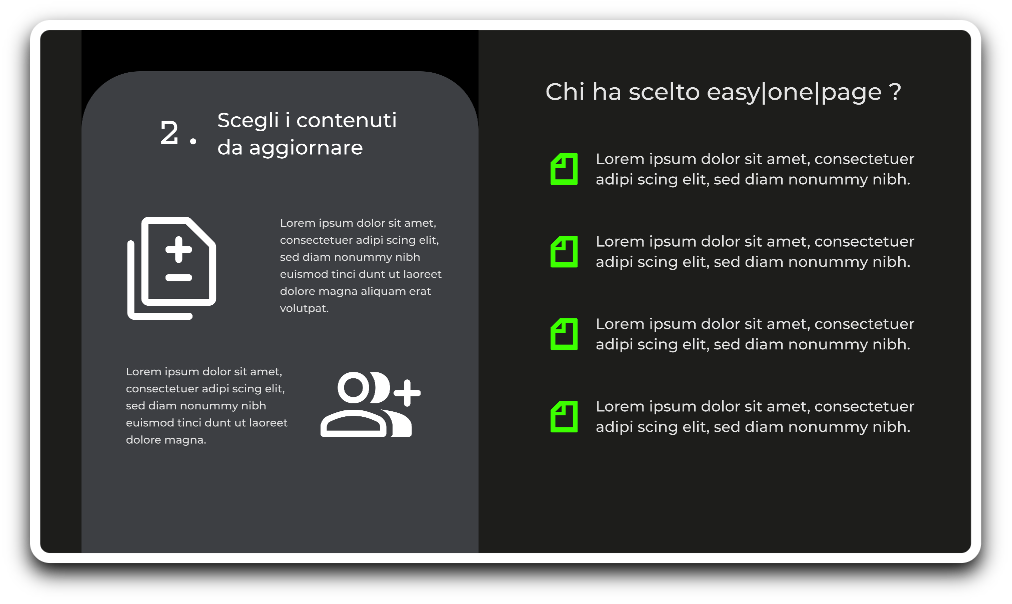
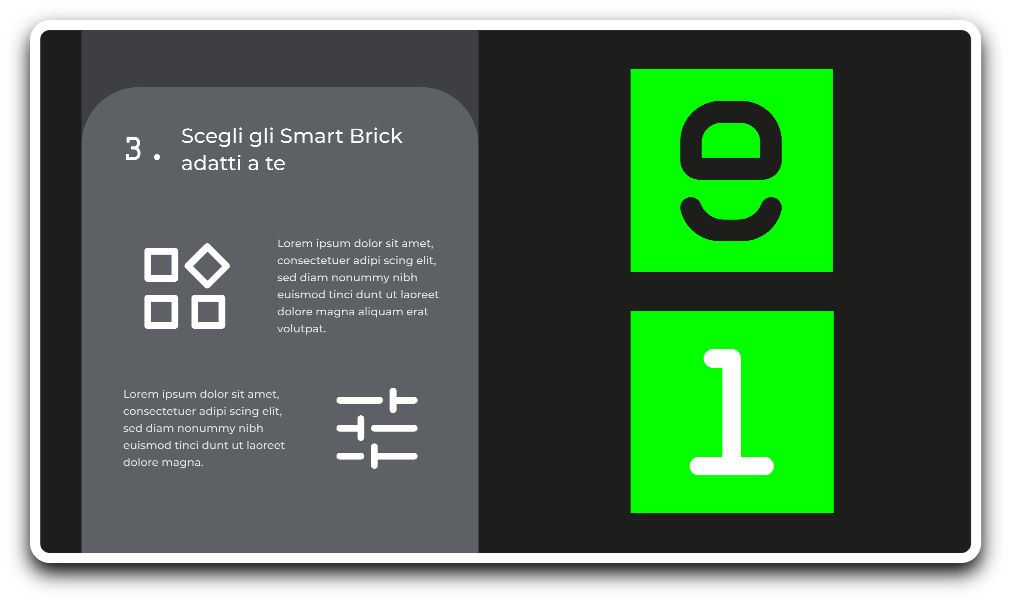
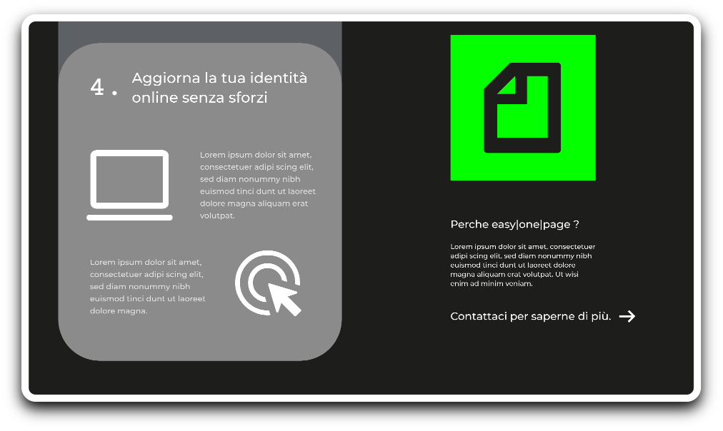
Information Architecture I:
I organized the website in two columns, the one on the left summarizes the necessary steps to personalize a template and create a strong web identity. The one the right provides key informations about EOP, like what niche of market it aims to fulfill and a list of previous clients showcasing their experience with the product. My primary goal was to highlight how quick and easy the process could be.
Information Architecture II:
The main content of the home page ends with step four. The space on the left is a call to action to establish a contact with the potential client interested in the service provided. By clicking on the arrow, the user’s mail app pops up with a pre-approved form for requesting more informations.
Mobile UI - Part I:
Condensing the desktop experience on a smaller sized screen has been designed with the same principles of symmetry used previously.
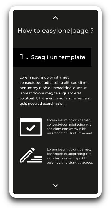
Mobile UI - Part I:
Condensing the desktop experience on a smaller sized screen has been designed with the same principles of symmetry used previously.
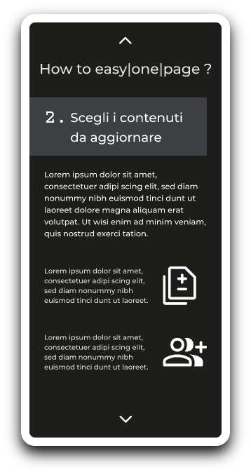

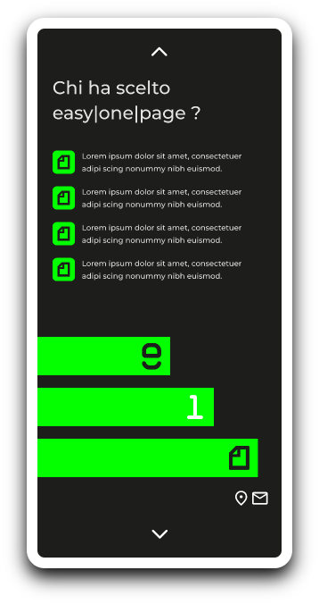
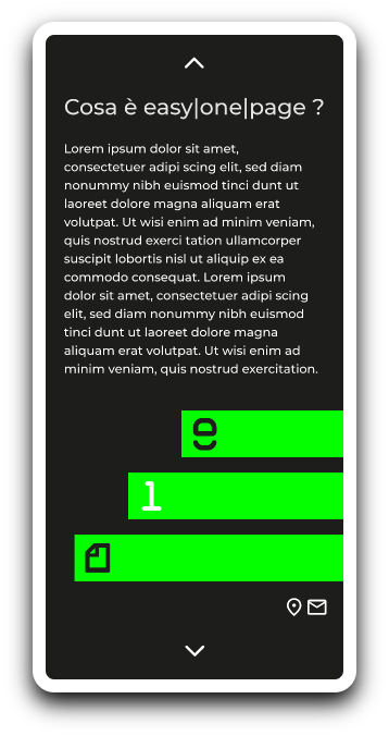
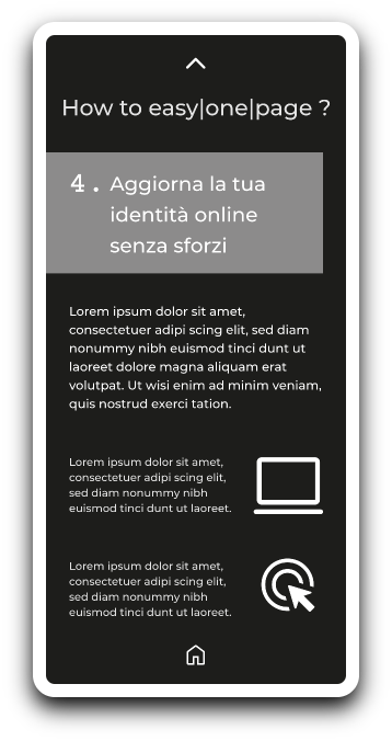
Mobile UI - Part II:
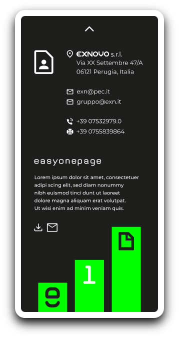
Since I couldn’t have two columns on mobile (one next to the other) I decided to introduce a scrolling prompt at the top and the end of each page with the purpose of of assigning a dedicated space on the screen to every step of the configuration. Contacts, call to action and previous clients have been added as an alternative user-flow.
Mobile UI - Part II:
Since I couldn’t have two columns on mobile (one next to the other) I decided to introduce a scrolling prompt at the top and the end of each page with the purpose of of assigning a dedicated space on the screen to every step of the configuration. Contacts, call to action and previous clients have been added as an alternative user-flow.


