CONNEcTING DOTS
Branding myself and Portfolio concept:
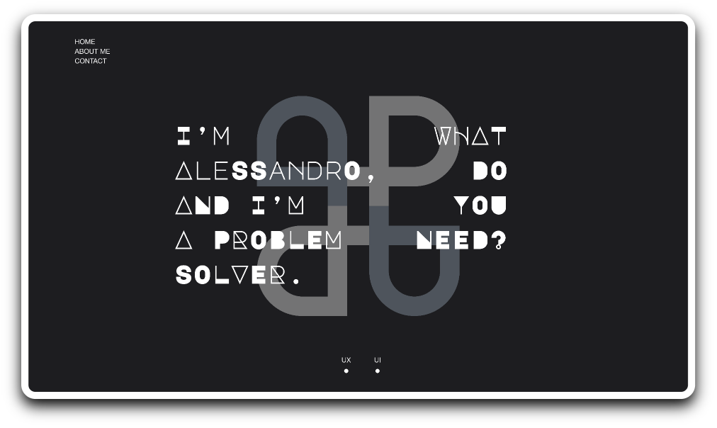
I designed “Connecting Dots” with a clear and recognizable identity in mind to showcase my work as a UX and UI designer. Since the type of projects and my contribution were so different from one to another, I needed a flexible frame capable of remaining consistent. Since my line of work is design, my goal was to brand my skills without relaying on already existing frames. I used my initials (AP) to design a personal logo that would recall the overall theme of smooth curves and connected elements I used in the website design.

How to introduce elements - Part I:
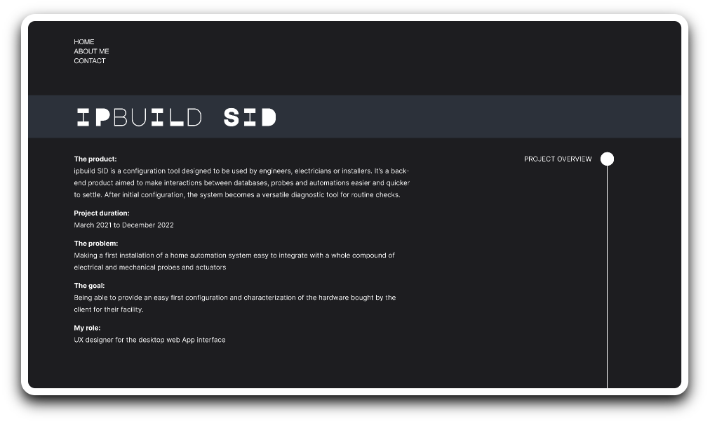
Both UX and UI projects are meant to be pieces of information connected to deliver a content or a message to a user, this was the overall guideline I used to present my work. In order to have an immediate visual impact on the viewer, I chose to differentiate the type of connections between UX projects and UI ones. For UX showcases, I used horizontal and vertical lines, straight forward links between text, images and screen. In my opinion, a more rational approach was the way to go in order to visually represent the nature of a UX study.

How to introduce elements - Part II:
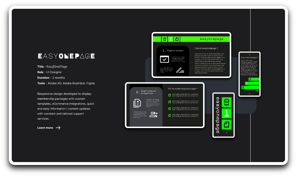
Considering the visual and graphic nature of the UI projects I worked on, I decided to embrace this trend as an opportunity to use vibrant colors instead of shades of grey and I tried to represent the idea of a chaotic creativity with broken lines instead of straight forward paths. In my opinion, the use of more intricate patterns without an unique starting and finishing point perfectly matches with my personal process of creation.


Highlight informations:
Information hierarchy was a key feature to implement on my portfolio project. Connecting Dots needed to have a clear distribution of visual weight between names of clients, brands, projects and the information connected. In order to highlight titles and elements I considered more important than others, I chose a combination of fonts, “Inter” a San Serif type with high legibility and “Major Mono Display” a monospaced geometric sans serif all-uppercase typeface.
How to showcase - Part I:
My main concern was to showcase enough details of each project to make my thinking process clear and show how I dealt with their specific challenges. Designing small clusters of informations with few sentences to explain the context was an effective way to present content. For both desktop products and mobile ones, my goal was to isolate elements from the background with a white edge and to highlight and justify my design choices.
How to showcase - Part II:
Since the nature of each UX case is different but the phases of design remain the same, I added an index of contents on the right with the main steps of each project. In this case I chose to combine as few graphic elements as I could, my main focus was highlighting the info and making it immediately clear to the reader without polluting their experience with other unnecessary components. Once again prioritizing the information made me choose a dichotomy of dark background and light elements.

How to showcase on mobile - Part III:
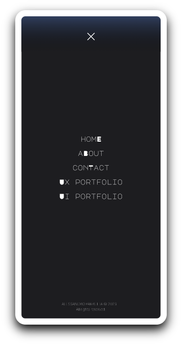
Designing a mobile experience for such long pages, with dense content and large part of text was challenging. My main concern was to provide the user with a quick way to navigate the content without being forced to reach the same top or bottom menu I designed for the desktop experience. For accessibility reasons, I opted for a fixed menu on the top, always reachable, that could provide a quick way to move from homepage, to portfolios or contact page.
How to showcase on mobile - Part III:
Designing a mobile experience for such long pages, with dense content and large part of text was challenging. My main concern was to provide the user with a quick way to navigate the content without being forced to reach the same top or bottom menu I designed for the desktop experience. For accessibility reasons, I opted for a fixed menu on the top, always reachable, that could provide a quick way to move from homepage, to portfolios or contact page.
How to showcase on mobile - Part IV:
Most of the design elements have been rearranged with a simple principle in mind: “let them breathe”. In my opinion, most of the mobile experiences can result in an overwhelming carousel of images, text and design elements. Instead of motivating the viewer to stay longer and get interested in the content, this approach suffocates the experience and has the exact opposite reaction: wanting to leave the page as soon as possible. In the overall portfolio project I tried my best to balance the amount of information needed and the blank space around.

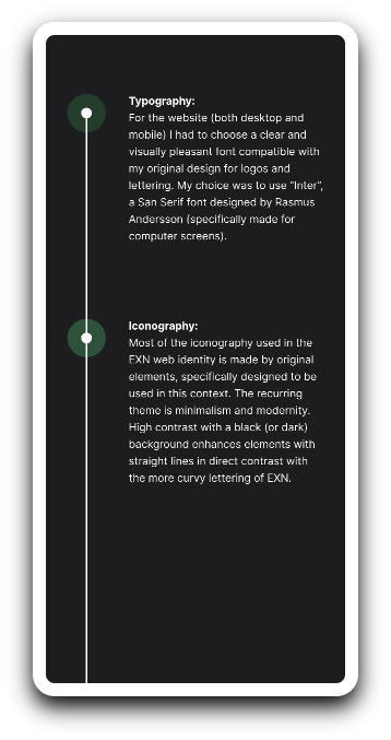
Typography:
For the typography I chose a combination of a simple San Serif type called “Inter” designed by Rasmus Andersson and “Major Mono Display” a monospaced geometric sans serif all-uppercase typeface designed by Emre Parlak. My goal was to provide an high legibility with the first one and a creative and unusual first impression with the second one. Providing contrast is an effective way to disrupt continuity and catch attention.
Iconography:
Since I designed this portfolio with the idea of linking elements and I named it “Connecting Dots”, most of the components I used to highlight text, new topics and design choices are circular shaped. I branded the UX studies with a grey shade (recalling an idea of precision and accuracy) and the UI projects with vivid colors to underline the creativity required for each one of them.
Images:
Images are provided by screenshots of other projects and apps I previously designed. Most of them (excluding the low fidelity prototypes of each UX study) were chosen to be accessible to visually impaired people thanks to an high index of contrast.
My take:
Designing an entire portfolio from scratch was an interesting challenge. Since I developed the project first hand from start to finish, I had a wide range of options. I could’ve chosen an already existing template, but I liked the idea of challenging my skills and prove to myself I could organize all this information in a consistent way. The process was longer than I anticipated but I learned more from this experience than I could possibly hope for when I started.